

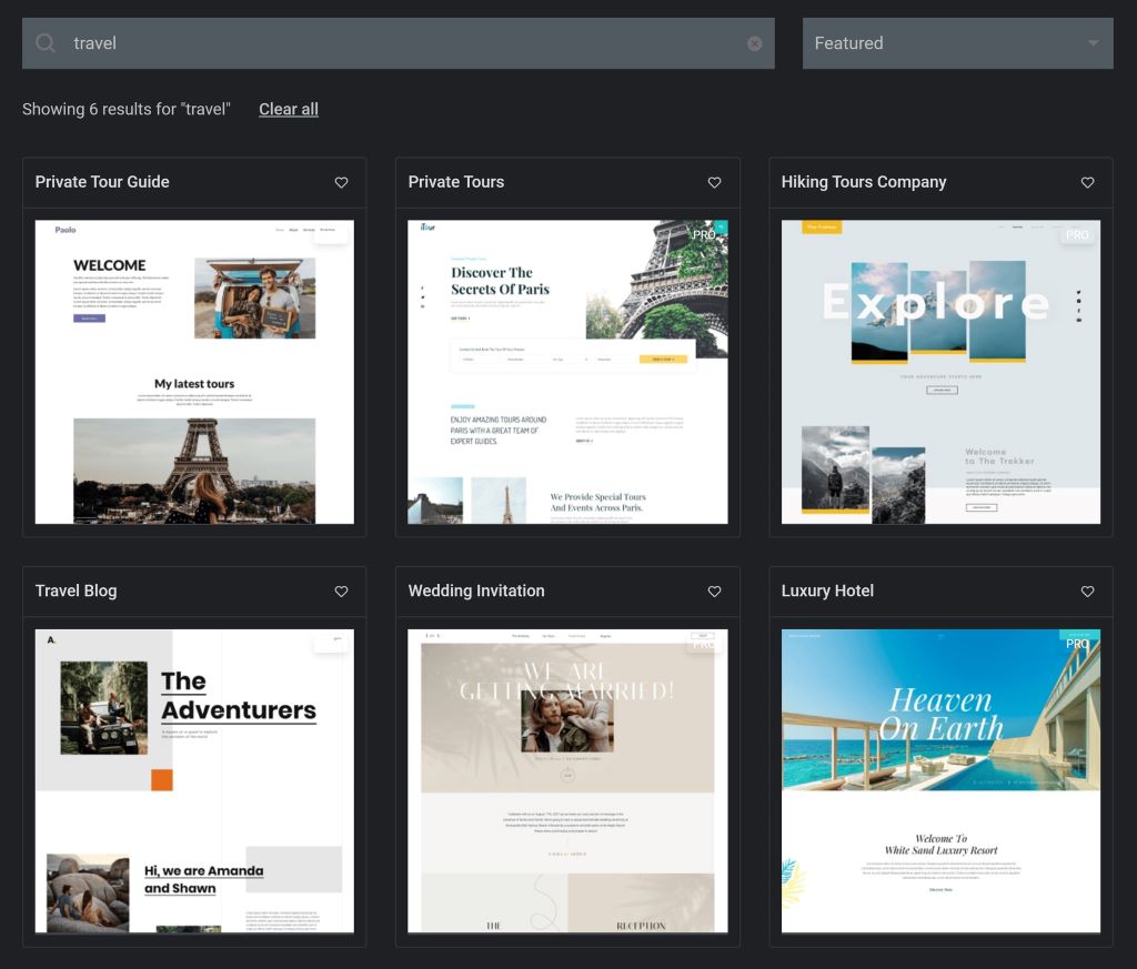
Imagine landing on a website that loads in a blink, greets you with stunning visuals, and guides you effortlessly to what you need. Now, picture the opposite: a cluttered, slow, and confusing digital maze. Which one would you trust? Which one would you revisit?
In 2026, your website is more than a digital business card—it’s your 24/7 salesperson, brand ambassador, and customer service rep rolled into one. Studies show that 75% of users judge a company’s credibility based on its website design (Stanford Web Credibility Research). Yet, 53% of mobile users abandon sites that take longer than three seconds to load (Google Research). The stakes are high, and the margin for error is slim.
Attractive website design isn’t just about aesthetics. It’s about psychology, usability, and strategy. It’s about understanding what makes visitors stay, engage, and convert. Whether you’re a startup founder, a seasoned marketer, or a designer, this guide will walk you through the science and art of crafting websites that don’t just look good—they perform exceptionally.
The Psychology Behind Attractive Website Design: What Keeps Visitors Hooked?
First Impressions Matter—More Than You Think
Humans form first impressions in 50 milliseconds (Google Research). That’s faster than a blink. Your website’s visual appeal, layout, and loading speed decide whether a visitor stays or bounces. A clean, modern design signals professionalism. A chaotic, outdated one screams neglect.
Pro Tip: Use high-quality images, consistent branding, and ample white space. Avoid clutter. Every element should serve a purpose.
The Power of Visual Hierarchy
Visual hierarchy guides visitors’ eyes to what matters most. Size, color, contrast, and placement determine where users look first. For example, a bold headline in a contrasting color draws attention. A tiny, gray call-to-action button gets ignored.
Example: Apple’s website uses minimalist design with large product images and sparse text. The result? Users focus on the product, not distractions.
Color Psychology: More Than Just Pretty Palettes
Colors evoke emotions. Blue builds trust (think Facebook, LinkedIn). Red creates urgency (sales, discounts). Green signals growth and health. Choose colors that align with your brand and audience.
Data Point: A study by the University of Winnipeg found that 90% of snap judgments about products are based on color alone.
The Role of Micro-Interactions
Micro-interactions—like a button changing color when hovered—add delight. They make your site feel interactive and responsive. These small details keep users engaged and reduce bounce rates.
Website UI Design: The Backbone of User Experience
Navigation: The Roadmap to Conversion
A confusing menu is like a maze without an exit. 44% of users will leave a website if there’s no clear contact information or navigation (Forrester Research). Keep menus simple. Use descriptive labels. Ensure users find what they need in three clicks or fewer.
Best Practice: Stick to standard navigation patterns. Users expect the logo to link to the homepage. Don’t reinvent the wheel.
Mobile-First Isn’t Optional—It’s Essential
Over 60% of web traffic comes from mobile devices (Statista, 2025). A desktop-only design alienates more than half your audience. Responsive design ensures your site looks great on any screen.
Pro Tip: Test your site on multiple devices. Use Google’s Mobile-Friendly Test tool to identify issues.
Speed: The Silent Conversion Killer
A one-second delay in page load time can drop conversions by 7% (Amazon Research). Optimize images, leverage browser caching, and minimize HTTP requests. Tools like Google PageSpeed Insights help pinpoint bottlenecks.
Example: Walmart increased conversions by 2% for every 1-second improvement in page load time.
Accessibility: Design for Everyone
15% of the world’s population lives with a disability (WHO). Ignoring accessibility means excluding millions. Use alt text for images. Ensure color contrast meets WCAG standards. Add keyboard navigation.
Resource: WebAIM’s Contrast Checker helps verify your color choices.
Web Design Tips from the Pros: What Works in 2026
Storytelling Through Design
People remember stories, not sales pitches. Use visuals, animations, and copy to tell your brand’s story. Airbnb’s website, for example, uses stunning photography and personal narratives to create emotional connections.
Actionable Tip: Replace stock photos with authentic images. Show real people using your product.
The Rise of Dark Mode
Dark mode reduces eye strain and saves battery life. 60% of users prefer dark mode (Android Authority, 2025). Offer both light and dark themes to cater to user preferences.
Video Backgrounds: Engage or Distract?
Video backgrounds can boost engagement—but only if done right. Autoplay with sound is a no-go. Use muted, looped videos that enhance, not distract.
Example: Nike’s website uses subtle video backgrounds to showcase products in action.
Personalization: The Future of Web Design
AI-driven personalization tailors content to individual users. Netflix and Spotify excel at this. Use data to recommend products, customize layouts, or greet returning visitors by name.
Tool Suggestion: Tools like Optimizely or Dynamic Yield make personalization easy.
Real-World Examples: Websites That Nail Attractive Design
1. Apple: Minimalism at Its Best
Apple’s website is a masterclass in simplicity. Large product images, minimal text, and intuitive navigation create a seamless experience.
2. Slack: Playful Yet Professional
Slack uses vibrant colors, playful illustrations, and clear CTAs. The design reflects its brand personality—friendly but efficient.
3. Stripe: Trust Through Design
Stripe’s website builds trust with a clean, professional look. Detailed documentation and transparent pricing reduce user anxiety.
4. Airbnb: Emotional Connection
Airbnb’s use of real photos and personal stories makes users feel at home—literally. The design focuses on experiences, not transactions.
Common Mistakes to Avoid in Website Design
Overloading with Information
Too much text or too many options overwhelm users. Stick to one primary goal per page.
Ignoring SEO in Design
A beautiful site is useless if no one finds it. Use SEO-friendly URLs, meta tags, and alt text.
Neglecting CTAs
Every page should guide users toward an action. Use clear, compelling CTAs like “Get Started” or “Learn More.”
Skipping User Testing
Assume nothing. Test your design with real users. Tools like Hotjar or UserTesting provide invaluable insights.
Related Topics:
FAQs: Your Burning Questions About Attractive Website Design
1. How often should I redesign my website?
Every 2-3 years is ideal. However, update elements like images, CTAs, and content regularly to stay fresh.
2. What’s the best color scheme for conversions?
It depends on your audience. Test different palettes. Blue and green often perform well for trust and growth.
3. Do I need a professional designer?
Not necessarily. Tools like Canva, Webflow, or Squarespace offer templates. However, a professional ensures a unique, high-performing design.
4. How can I improve my website’s loading speed?
Compress images, use a CDN, and minimize plugins. Google’s PageSpeed Insights provides tailored recommendations.
5. What’s the role of typography in web design?
Typography affects readability and mood. Stick to 2-3 fonts max. Use sizes and weights to create hierarchy.
6. Should I use pop-ups?
Use them sparingly. Exit-intent pop-ups can recover abandoning users, but too many annoy visitors.
7. How do I measure my website’s success?
Track metrics like bounce rate, time on page, and conversion rates. Tools like Google Analytics provide deep insights.
Conclusion: Your Website Is Your Greatest Asset—Design It Wisely
Your website is the digital face of your brand. It’s where first impressions form, trust builds, and conversions happen. Attractive website design blends art and science—psychology, usability, and aesthetics.
Start with a clear strategy. Understand your audience. Test relentlessly. And remember: the best designs are invisible. Users shouldn’t notice the design—they should notice the experience.
Ready to transform your website? Audit your current design. Identify one area to improve today. Whether it’s speed, navigation, or visuals, small changes can yield big results.