

A service page has one job: help a local buyer decide that you are the right fit and then take the next step—call, book, or request a quote. Everything else on that page either supports that decision or gets in the way. Customer reviews are powerful on these pages, but only when they sit in the right spots and when the page stays disciplined about what not to show.
This is not a tour of your whole website. It is a layout playbook for the pages that sell a specific offer: residential AC repair, dental cleanings, kitchen remodels, lawn care packages, commercial cleaning routes. Those pages already carry a headline, a short explanation, proof of capability, and a call to action. Reviews belong inside that structure as targeted reassurance—not as a second homepage feed pasted under every H2.
Think in sections, not “add social proof somewhere”
Most service pages fail at reviews for the same reason they fail at copy: owners treat the page like a scrapbook. A star carousel lands in the hero because it looks impressive. Another widget appears after pricing. A third repeats in the sticky footer. The visitor never gets a clean path from “Do you do this?” to “I will contact you.”
Design the page as a sequence of decisions:
- Confirm the offer matches the need
- Reduce risk (credentials, process, locality, reviews)
- Make the next action obvious
Reviews earn their keep in step two and at the hinge into step three. They do not replace step one. If someone still does not understand what you install, repair, or schedule, a five-star wall will not save the conversion.
A Google Review Widget is useful when you want live ratings and a curated set of comments on the pages that actually sell—without hand-pasting quotes every time a new review arrives. The product choice matters less than the section choices below. Restraint beats abundance.
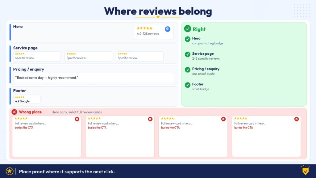
Where reviews should sit on a converting service page
Directly beside or under the primary CTA
This is the highest-value placement for most local service pages. When a visitor is about to tap “Request estimate,” “Book online,” or “Call now,” last-second doubt spikes. A compact rating summary—stars, average, review count—or one short, relevant quote within eyeshot of that button answers the doubt without forcing a detour.
Proximity matters more than length. Two lines next to the form often outperform a long carousel three scrolls away. On desktop, a narrow column beside the form works well. On mobile, place a slim proof strip immediately above the form fields so the thumb does not have to hunt.
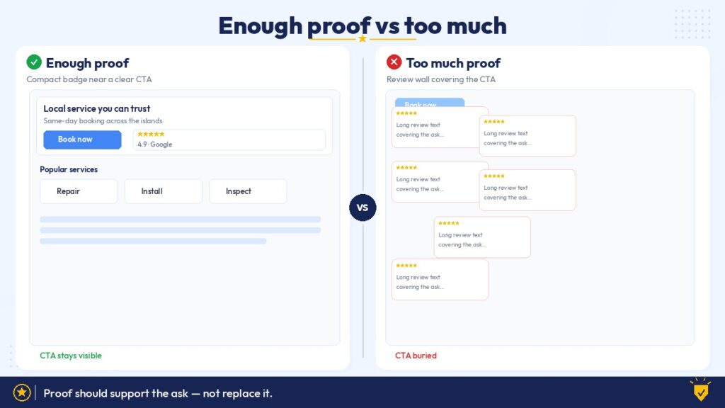
Keep the visual weight secondary to the CTA. Stars and a count should support the button, not compete with it. If the review block is louder than “Get my quote,” you have inverted the hierarchy.
After the service explanation, before the long detail
Once the visitor knows what the service includes, a short proof block validates the claim. This is a good home for two or three reviews that mention the specific service, timeline, or outcome—not generic “great company” lines.
Useful pattern:
- Brief service overview
- Process or what’s included
- Three tight reviews tied to that service
- CTA repeat or secondary form
Avoid parking reviews before the visitor understands the offer. Praise without context feels like marketing noise.
Near outcome-heavy content (galleries, case notes, before/after)
If your service page already shows completed work, reviews that echo those outcomes reinforce each other. A remodel gallery plus a short note about communication and clean job sites does more than either element alone. A lawn-care package page with seasonal photos pairs well with comments about consistency and punctuality.
Match the proof type to the proof already on screen. Do not drop a restaurant-style food review tone onto a commercial HVAC page. Tone mismatch erodes trust faster than silence.
In a dedicated “What clients say about this service” block—kept short
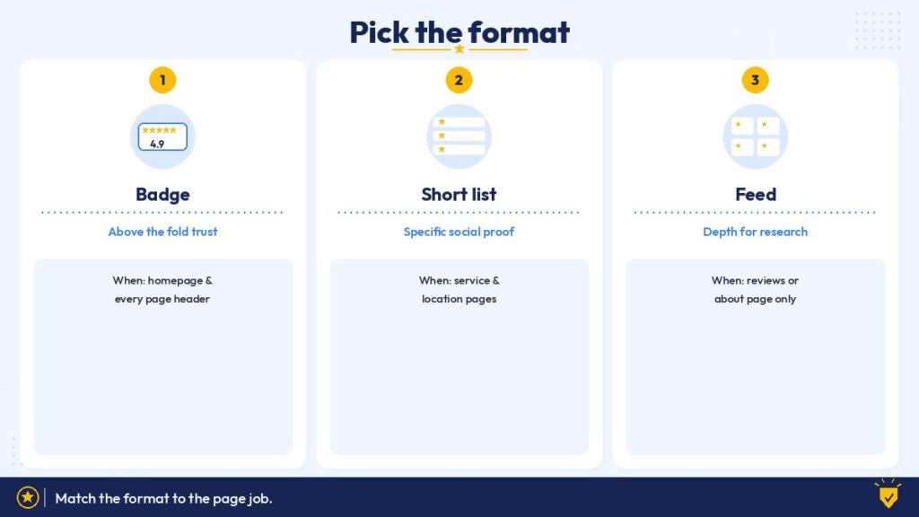
A labeled section is fine when the page is long and you need a clear resting point before FAQs or the final CTA. Cap it. Three to five reviews, or a filtered feed with a hard height limit, is usually enough. Infinite scroll on a service page is a design failure dressed as social proof.
If you use a feed, pin or filter toward comments that name the service, the island or neighborhood, or a concrete result. Relevance beats volume on converting pages.
Badge versus feed: choose by section job
Use a badge or rating summary when the section’s job is action
Hero CTAs, sticky mobile bars, form headers, and pricing package cards usually need a glanceable trust signal—not reading material. A badge answers “Are people happy?” in under a second. That is often all the section can afford.
Badges also load lighter and shift layout less when implemented carefully, which helps Core Web Vitals on pages that already carry maps, galleries, and forms. Google’s guidance on measuring real-user experience remains a useful north star for any third-party embed; see web.dev’s Core Web Vitals overview when you evaluate how review modules affect speed and stability.
Use a short feed or quote set when the section’s job is reassurance through detail
Mid-page trust sections, service-specific proof strips, and post-gallery validation can carry readable comments. Even then, prefer curated quotes or a capped carousel over an unfiltered stream. A visitor comparing two plumbers does not need twenty near-identical five-star blurbs.
Do not mix both in the same viewport without a reason
Stacking a big badge and a tall feed above the fold burns the most expensive real estate on the page. Pick one primary review treatment per viewport. Repeat lighter proof later if needed.
What to leave out (this is where most pages go wrong)
Leave the full review wall out of the hero
The hero should establish the service, the locale, and the next step. A scrolling multi-review widget in that first screen pushes the phone number and form down, especially on mobile. It also asks the visitor to read before they know whether you even offer what they need.
If you want proof in the hero, use a compact rating line or a single attributed sentence under the headline. Anything longer belongs later.
Leave unrelated reviews off the page
A service page for septic inspections should not lead with praise about your retail gift shop. An emergency leak-repair page should not feature leisurely remodel testimonials that imply slow timelines. Irrelevant social proof creates cognitive friction: “Is this the same team?”
Filter hard. Service-specific pages deserve service-specific proof.
Leave duplicate review modules out
One primary review treatment plus one light reinforcement (for example, a badge near a mid-page CTA) is usually enough. Repeating the same feed three times signals insecurity and adds weight. If the visitor ignored the first block, a clone will not convert them.
Leave raw star dumps without context out of pricing sections
Pricing and package areas are already cognitively heavy. A tall feed that splits a pricing table or sits between package cards makes comparison harder. Prefer a badge and, at most, one value-focused quote (“clear estimate,” “no surprise fees,” “explained options”).
If you accept deposits or invoices through PayPal, keep payment notes clean and separate from review chrome. Mixing checkout instructions with a noisy carousel makes the commercial moment feel messy.
Leave auto-playing, layout-shifting, or oversized carousels out
Anything that jumps the page while the form is loading trains people not to trust your layout. Oversized carousels also fight sticky CTAs and chat widgets for thumb space. If a review module cannot stay visually quiet, it does not belong on a conversion page.
Leave negative or unresolved threads out of marketing placements
Public Google reviews live on your profile whether you like them or not; that transparency is part of how Google Business Profile works, and Google documents how reviews appear and how businesses can respond in Google’s Business Profile help. On your own service page, you still choose what to feature. Highlighting unresolved complaints next to a book button is not honesty—it is self-sabotage. Address tough feedback on Google; curate the on-page selection toward accurate, representative praise and clear outcomes.
When not to show reviews on a service page
Reviews are not mandatory decoration. Skip or minimize them when:
- The page is intentionally thin. A simple “service area / call for availability” page may only need a rating badge in the header or footer.
- You lack relevant proof for that offer. Better a clean page than generic praise that does not match the service. Build reviews for that line of work first.
- The CTA is already overloaded. If the form, phone, hours, and financing notes already crowd the decision zone, add a badge only—or nothing.
- Legal or professional constraints apply. Some regulated offers require careful claims language. Keep featured comments factual and avoid implying guarantees the reviews do not support.
- You are A/B testing clarity. If bounce or form starts are weak, test a version with less proof chrome. Sometimes the page fails because the offer is unclear, not because stars are missing.
Knowing when to withhold reviews is part of conversion design. Empty space that lets the CTA breathe can outperform another carousel.
Mobile layout decisions that change conversion
Most local service traffic decides on a phone. Section order that works on a wide desktop monitor can fail in a single column.
Practical mobile rules:
- Put a slim rating badge or one-line proof above the primary form, not buried under it
- Keep review text short; long paragraphs force endless scrolling before the button
- Avoid carousels that steal vertical space from the phone number
- Prefer static quote cards over auto-advance widgets when the form is nearby
- Test with a real thumb: can someone read the offer, see stars, and tap without hunting?
Local search behavior also shapes expectations. People who find you from Maps or a local pack often arrive already half-convinced by your Google rating; your page’s job is to confirm fit and make contact easy. Industry research on how consumers use reviews in local decisions—such as surveys published by BrightLocal—consistently points to review relevance and recency mattering alongside star averages. On a service page, that translates to showing recent, on-topic comments near the action—not an archive of every five-star line you have ever earned.
Section-by-section checklist for Hawaii Web Studio builds
Use this as a pass/fail audit on any service template:
Hero
- Badge or one quote: yes
- Full feed: no
Offer / what’s included
- Reviews: optional, only if brief and relevant
CTA / form zone
- Rating summary in view: yes
- Competing tall widget: no
Gallery / outcomes
- Matching quotes: yes
- Unrelated praise: no
Pricing / packages
- Badge + optional value quote: yes
- Feed splitting the table: no
FAQs
- Reviews: usually skip; keep answers scannable
Final CTA
- Light reinforcement OK
- New full feed: rarely
Footer
- Small badge or profile link: fine
- Primary conversion proof: no
Writing and design details that keep reviews working
Attribute like a human, not a billboard
“Maria K., Kailua — AC repair last summer” feels local and credible. “5-star Google User” repeated twelve times does not. Keep names and places consistent with what Google shows when you can; do not invent details.
Match voice to the brand without rewriting reviews
You can trim for length and clarity where the platform allows display choices, but do not polish customer language into marketing copy. People smell that. Design-aware local brands win by looking intentional, not by sounding corporate in someone else’s mouth.
Align color and type with the page system
Review cards should use the same type scale, spacing, and accent color as the rest of the service template. A widget that arrives with its own loud chrome fights the CTA and looks bolted on. Soft product embeds that inherit your styling tend to convert better because they feel native.
Keep “leave a review” prompts off the conversion path
Asking current visitors to write a review belongs on thank-you pages, invoices, or follow-up email—not beside the first-time quote form. Mixing “hire us” and “rate us” confuses the moment.
A practical assembly order for a high-converting service page
When you rebuild or redesign a service page, assemble proof in this order rather than sprinkling widgets wherever there is white space:
- Write the offer and CTA first
- Add credentials, process, and locality cues
- Place a compact rating summary at the decision hinge
- Add two to five relevant reviews mid-page if the offer needs narrative proof
- Cut anything that duplicates, shifts layout, or dilutes relevance
- Check mobile thumb path last
That sequence keeps reviews in service of conversion instead of treating them as a separate marketing project living on top of the page.
Bringing it back to conversion, not decoration
Service pages convert when they stay clear under pressure. Reviews help when they sit next to the moment of doubt, speak to the same service the visitor is considering, and stay visually quiet enough that the call to action still leads. They hurt when they occupy the hero, repeat three times, load late, or talk about a different job than the one on the page.
For local and service businesses—especially those working with a design-aware studio partner—the winning move is editorial: decide where proof belongs, decide what to cut, and let the rest of the page do its job. Badge at the CTA. Short, relevant quotes where reassurance is needed. Nothing extra in the way.
If you already collect strong Google reviews, the opportunity is not “more widgets.” It is better placement, tighter selection, and the discipline to leave the wrong proof off the page.